OVERVIEW
Herbarium is an LA-based dispensary shop that specializes in recreational cannabis use, they also service patients that need cannabis for their medical conditions. Since 2016 they have been striving to grow their business to the point where they are now, a popular LA dispensary with one of the biggest selections in their area.
GOAL
The goal for Herbarium is to retain customers who continuously use the website by creating a clean interface for an easy browse, and a checkout process that is simple to complete.
Research
I evaluated what customers would have a problem with as they go through the website. One of the main constraints I found was that the hero image was big and Flashy, this is a concern because having to deal with medical patients, this could affect someone that has a problem with flashing lights. Some other issues I found was that when you went to look at the products, it would take you to a different page and there was no way to get back home, there was no notification when you added a product to your cart and there was no global search to be able to find your exact product.
Because of this, I did a comparison of some of our competitors, 3 out of 3 companies had the main components needed for a fast and easy process with ordering cannabis online, from a Global Search, CTA to go back home, and shopping cart notifications and a way for the checkout process to be completed with ease.
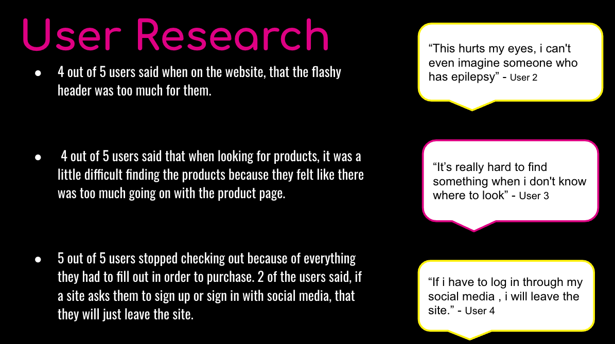
This leads me to my user research where I conducted 5 user interviews with real cannabis users so we understand the pain points someone who uses an online cannabis delivery shop regularly.
After all the information from the usability test was gathered I was able to find the main pain points people had as they went through the cannabis delivery tasks. From that information, I was able to bring to life our persona Christan Burke.
How Might We
Problem Statement
Christian has a busy schedule and needs a secure and efficient way to order cannabis for the delivery because he doesn’t have time to visit the dispensary, and the current website he is using is confusing and difficult to navigate.
So How might we help Christian order cannabis when he is busy and not able to visit his dispensary while being confident in the service by making sure he gets exactly what he needs when he needs it?
The solutions I came up with for Christan were …
Improving navigation through the website
Organize the products in a more efficient way
Create ONE website for the Brand
Design
In the design process, I kept in mind some key features from the research.
Better product navigation
Clear visual of products
Automatic payment info with account
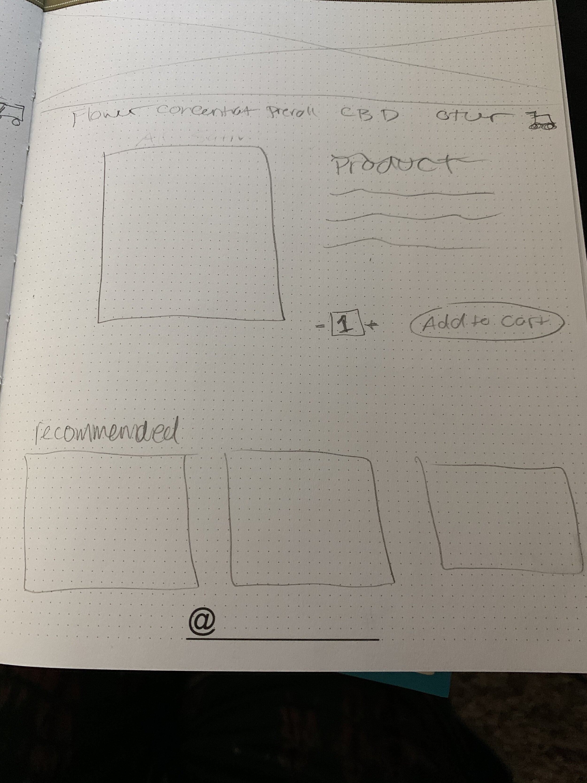
I then started with some sketches, trying to see how things would be grouped and the get skeleton of the new redesign. Starting with the main home page, and the product pages.
When I found the structure for the website, I then started on my Mid-fidelity, this is where everything started coming together. I was super excited to test how my solution to this website could help Christian.
Sketches
Mid-fidelity
Usability test results.
3 out of 3 users found it to be a lot easier to navigate and find the product with the new solution.
3 out of 3 users were able to get the task that was given in under 3 min without any mistakes.
2 of the 3 appreciated how when you log in to your account that all the information is saved and made the checkout simple and easy.


